

An accessible web for everyone is something that not enough developers have been caring about. It is only now that more and more developers start to realize how important this is.
We, at Timble, try to make our websites as accessible as possible. We are working hard on creating automated workflows so we know our sites will stay accessible over time. This is important because accessibility is something that is mainly invisible to most of us. Making sure that every change you make is and stays accessible is really hard and that's why we are using several tools to check these changes.
Things to look out for
All guidelines are explained in detail on the WCAG 2.0 guidelines page. I would like to highlight a few here.
Contrast and color
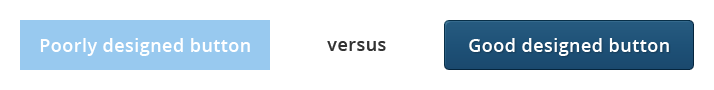
Why is contrast so important? Imagine a light blue button with white text. People with low vision won't be able to properly read the text in the button. If, on top of that, the contrast between the page background and the button background isn't high enough people with low vision won't see that button at all.
Underlined text
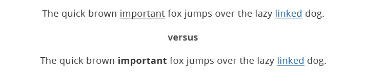
Most WYSIWYG editors allow you to underline text, that’s rather a bug than a feature.
Only links should be underlined. Users with partial sight often experience limited color vision. To them all underlined text are links because they don’t see the difference in color.
Focusing
Older people might have trouble tracking a pointer and rather navigate using their keyboard. That’s just one reason why keyboard navigation is very important.
The default styling for focussed elements in a lot of browsers has always been a small dotted dark outline. However, most developers remove the focus styling because they don’t like the outline.
We think it also tremendously helps people who are navigating with a mouse. Instead of hiding the default browser outline we even increase it to make it more visible.
Keyboard control
Navigation is the key on every webpage. A common mistake is to use non focusable elements (<div> or <span>) as buttons using Javascript.
As a result, when using the keyboard the buttons will be skipped and a user is never able to click it. Always use focusable elements (<a> or <button>).
Tools
As mentioned before it is really hard for sighted people to see whether pages are truly accessible since almost all 'accessible' stuff happens under water. There are also things that should be very obvious but that are actually not. For example, a bad color contrast ratio is harder to notice for someone who has no vision problems.
Here is a list of tools that we use to make our pages as accessible as possible.
1. Keyboard
Every developer has at least one keyboard, but have you ever used it to test the accessibility of your newly developed website?
It's a good thing to put your mouse away every now and then and try to use your own website keyboard only. At that point you will see how difficult some websites actually are to use.
2. Contrast and color
Visually test the color contrast for a particular page or your whole screen:
- Color contrast analyzer (Chrome extension)
- Colour contrast analyzer (Mac/Windows app)
- Color oracle (Mac/Windows\Linux app)
3. Automatic page testing
Test a page for common accessibility issues:
- Accesslint
- AChecker
- The A11y Machine
- Tingtun accessibility checker
- Wave (All links stay clickable, good for testing multiple pages)
4. Screen reader
Let your browser or computer read all content out loud:
If you know all keyboard shortcuts of these tools try to dim your screen to black for the real "I can't see anything" experience.
Search engines
When making sure your websites are being built optimally for accessibility it means that your site is being optimized for search engines as well. Building an accessible website makes sure that the quality of your website is getting much better. Search bots also have a much clearer view of what your website is about when you’re using good alternative texts, proper headings, ordered or unordered lists, etc.
Worth the trouble?
According to World Health Organization, there are 285 million people worldwide who, due to some disability cannot read all content on a website. 39 million of those people are blind and cannot access any of the content via sight.
That means that if you don't care about accessibility you might end up missing out on a lot of people. We believe information needs to be accessible to everybody.
If you are not testing accessibility yet this is probably a good time to start. If the WCAG guidelines seem like a monster task to you then start small and keep iterating.
Following these guidelines will also often make your web content more usable to users in general. - WCAG guidelines